Did you know that 90% of retail traders lose money — not because they pick bad trades, but because they never track whether their strategy actually works over time?
The difference between a trader who survives and one who blows up their account almost always comes down to one thing: equity curve analysis.
An equity curve is a graphical representation of your trading account’s value over time. It plots your cumulative profit and loss (P&L) as a line chart — showing you the complete picture of whether your trading strategy is growing your capital or silently destroying it.
Unlike reviewing individual winning or losing trades, an equity curve reveals the overall health, consistency, and risk profile of your trading strategy in a single glance. It answers the questions that really matter:
- Is my strategy actually profitable — or just getting lucky?
- How deep are my drawdowns, and can I survive them emotionally and financially?
- Is my account growing consistently or swinging wildly?
- When should I stop trading a strategy before it ruins my account?
An equity curve is a chart that shows the total value of a trading account over time by plotting cumulative profits and losses. It is used to measure trading performance, identify drawdown risk, and evaluate whether a strategy is consistent and profitable over the long term.
Whether you are a day trader, swing trader, options trader, or long-term investor — if you are not analyzing your trading equity curve, you are flying completely blind.
In this guide, you will learn:
- What an equity curve is and how to read it
- The exact formulas for equity and drawdown calculation
- How to build your own equity curve step by step
- What a good equity curve looks like vs. a dangerous one
- The moving average method for equity curve trading
- The best free and paid tools for performance tracking
Let’s dive in.
Quick summary
| Concept | Benefit |
| Equity Curve Analysis | Shows account growth & weaknesses |
| Trading Equity Curve | Reveals trends & drawdowns |
| Performance Tracking | Improves strategy & decisions |
What is an Equity Curve?
An equity curve is a graphical representation of your trading account’s value over time. It plots cumulative profit and loss on a chart — showing you whether your strategy is growing your capital or destroying it. Unlike looking at individual trades, an equity curve reveals the overall health of your trading strategy at a glance. It is the single most important tool for trading performance tracking.
What is Equity Curve Analysis?
Wondered whether your trading strategy is effective or not? The analysis of the equity curve will tell you the equity curve of your trade over the years in terms of gains and losses. It does not show your performance in single trades, but in actual fact, your performance.
As well, with straightforward tracking of performance, you are able to identify trends, control risk, and make smarter trading decisions.
Basic Equity Curve Formula:
Equity = Initial Capital + Closed P/L + Open P/L
Drawdown % = (Peak Equity – Lowest Equity) / Peak Equity × 100
Why Equity Curve Analysis Matters for Traders
The analysis of the equity curves is like driving without using the steering wheel. It is not the isolated wins that are reflected in your trading equity.
- Discloses validity and actual trends.
- Underlines the demerits before their injury.
- Keeps emotions in check
- Measures risk accurately
Making smarter and more confident trading decisions can be done with simple tracking of performance.
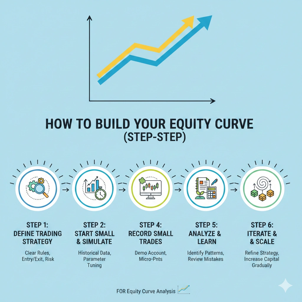
How to Build Your Equity Curve (Step‑by‑Step)
It is not as difficult as you imagine to make your trading equity. Here’s a quick guide:
Step 1 — Collect Your Trade Data
To begin with, one must collect the essentials:
- Entry price
- Exit price
- Position size
- Date and time
- Profit or loss
Step 2 — Record Account Balance
Post periodic trade or daily.
Step 3 — Chart Your Equity
Use Excel, Google Sheets, or tracking of performance programs.
Step 4 — Interpret the Curve
Drawdowns, aggregate trends, and growth streaks.
When you track performance with consistent actions, your analysis of the equity curves gives you the actual account of what you are doing as a trader.
If your account grows from ₹1,00,000 to ₹1,30,000 and later falls to ₹1,15,000:
- Peak = ₹1,30,000
- Trough = ₹1,15,000
- Drawdown = 11.5%
This shows the strategy is profitable but volatile.
Interpreting Your Trading Equity Curve
Go with your trading equity chart? Here’s how to read it:
A. Upward Slope
Even a steady increase means the strategy is functioning, and tracking of performance is favorable.
B. Flat or Choppy
Wobbly curve = uneven trades; adjust your style.
C. Drawdowns
Dips = learning to enhance risk management.
D. Peaks and Valleys
Rough swings are more risky; smooth gains are less risky in the long term.
5 Types of Equity Curves Every Trader Must Know
| Curve Shape | What It Means | Trader Stage |
|---|---|---|
| Steady upward slope | Disciplined, rule-based trading | Professional |
| Boom & bust (sharp peaks/crashes) | Emotional, inconsistent risk | Intermediate |
| Flat/horizontal curve | Hesitant execution, no edge | Early-stage |
| Curve-fitted/too smooth | Over-optimized, won’t work live | Dangerous |
| Gradual growth with small dips | Balanced risk-reward strategy | Consistent |
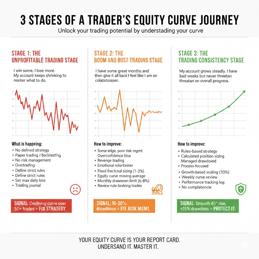
3 Stages of a Trader’s Equity Curve Journey
Every trader — no matter how successful today — has passed through the same three stages. Your equity curve tells you exactly which stage you are in right now and what you need to do next.
Understanding these stages is not just motivating — it is practically useful. It stops you from quitting too early, over-risking too soon, or ignoring warning signs that your strategy needs fixing.
Stage 1 — The Unprofitable Trading Stage
“I win some, I lose more. My account keeps shrinking no matter what I do.”
This is where every trader begins. Your equity curve at this stage looks like a downward slope with random spikes upward — occasional wins that give false hope before the account falls further.
What your equity curve looks like: A declining line with sharp upward spikes followed by steeper drops. The overall direction is down and to the right.
What is happening:
- No defined trading strategy or rules
- Position sizing is emotional, not calculated
- Wins feel like skill; losses feel like bad luck
- Risk management is either absent or inconsistent
- Overtrading is common — more trades to recover losses faster
The danger at this stage: Most traders in the unprofitable trading stage do not realize they are here. They attribute losses to market conditions, bad luck, or broker manipulation — rather than looking at what their equity curve is actually telling them.
How to improve your equity curve at Stage 1:
- Stop trading live — go back to paper trading or backtesting
- Define strict entry, exit, and position sizing rules
- Set a maximum daily loss limit and stop when you hit it
- Track every trade in a trading journal
- Aim for 100+ backtested trades before going live again
Equity Curve Signal: If your curve is declining over 50+ trades, your strategy has no statistical edge. Stop. Fix the strategy first.
Stage 2 — The Boom and Bust Trading Stage
“I have some great months and then give it all back. I feel like I am on a rollercoaster.”
This is the most dangerous stage — and the one where most traders get stuck for years. Your account grows, you feel confident, you take bigger risks — and then a losing streak wipes out weeks or months of gains in just a few days.
What your equity curve looks like: Sharp peaks followed by deep valleys. The curve moves aggressively in both directions. Overall it may be slightly profitable or flat — but the drawdowns are deep and painful.
What is happening:
- The trader has some edge but terrible risk management
- Position sizes increase after winning streaks (overconfidence bias)
- Strategy rules get broken during drawdowns (revenge trading)
- Boom and bust trading creates an emotional rollercoaster that leads to burnout
- The trader may actually be profitable on paper but cannot hold onto gains
The danger at this stage: A boom and bust equity curve fools traders into thinking they are progressing. Some months look incredible. The Profit & Loss statement might even show a positive year — but the psychological damage of the deep drawdowns causes most traders to eventually quit or blow up.
How to improve your equity curve at Stage 2:
- Apply fixed fractional position sizing — never risk more than 1-2% per trade regardless of confidence
- Use the equity curve moving average method — reduce size when your curve drops below its moving average
- Set a monthly drawdown limit — if you lose 6-8% in a month, stop trading for the rest of the month
- Review every trade where you broke your rules — rule-breaking is the core problem here
- Focus on drawdown reduction before chasing more profit
Equity Curve Signal: If your curve regularly retraces more than 15-20% of its peak, you are in boom and bust trading mode. The fix is risk management — not a new strategy.
Stage 3 — The Trading Consistency Stage
“My account grows steadily. I have bad weeks but they never threaten my overall progress.”
This is where professional traders operate. The equity curve at this stage does not look exciting — and that is exactly the point. Consistency beats excitement in trading every single time.
What your equity curve looks like: A smooth, gently rising line with small, controlled drawdowns. There are no dramatic peaks or crashes. The curve moves upward steadily month after month.
What is happening:
- The trader follows a defined, rules-based strategy without exception
- Position sizing is calculated mathematically on every trade
- Drawdowns are expected, planned for, and emotionally managed
- The focus has shifted from “making money” to “executing the process”
- Trading consistency is the primary goal — profits are the natural result
What a Stage 3 equity curve looks like in numbers:
- Maximum drawdown: Below 10-15%
- Profit Factor: Above 1.5
- Sharpe Ratio: Above 1.0
- Win Rate: Consistent — not wildly swinging month to month
- Monthly returns: Steady and repeatable — not dependent on one big trade
How to stay at Stage 3 and protect your trading consistency:
- Never increase position size unless your account has grown by a set threshold (e.g., every 10% account growth)
- Review your equity curve weekly — not just your P&L
- Keep a performance tracking log that flags when drawdown exceeds your personal limit
- Treat every month like the first month — no complacency
Equity Curve Signal: A trading consistency stage curve rises approximately 45 degrees with drawdowns that recover quickly and never exceed 15%. If this is your curve — protect it above everything else.
The 3 Stages at a Glance
| Stage | Curve Shape | Core Problem | Primary Fix |
|---|---|---|---|
| Unprofitable Trading Stage | Declining with random spikes | No edge, no rules | Backtesting + journaling |
| Boom and Bust Trading | Volatile peaks and valleys | Poor risk management | Fixed position sizing |
| Trading Consistency Stage | Smooth upward slope | Maintaining discipline | Process over profits |
The Most Important Lesson from the 3 Stages
Most traders try to skip Stage 1 and 2 by copying strategies, buying signals, or switching systems constantly. It never works.
The equity curve does not lie. It shows you exactly which stage you are in — and how to improve your equity curve is always the same answer: fix the stage you are currently in before chasing the next level.
Pro Tip: Print your equity curve every month. Stick it somewhere visible. Ask yourself honestly — “Which stage am I in right now?” That one question, answered honestly, is worth more than any trading course.
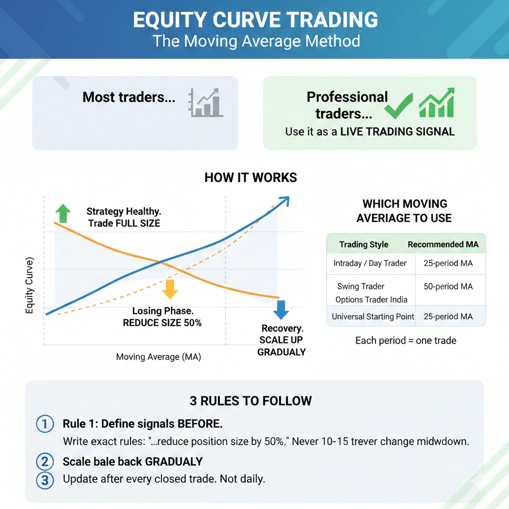
Equity Curve Trading — The Moving Average Method
Most traders use their equity curve only to review past performance. Professional traders use it as a live trading signal — telling them exactly when to trade full size, when to reduce risk, and when to stop altogether.
This is called equity curve trading.
How It Works
Apply a moving average directly onto your equity curve — exactly like you would on a price chart — and use it as a signal to manage your strategy exposure:
| Curve Position | What It Means | Action |
|---|---|---|
| Curve above MA | Strategy in healthy phase | Trade at full position size |
| Curve drops below MA | Strategy entering losing phase | Reduce size by 50% |
| Curve crosses back above MA | Recovery beginning | Scale up gradually |
Just as a moving average on a price chart tells you whether a stock is in an uptrend — a moving average on your equity curve tells you whether your strategy is in a winning or losing phase.
Which Moving Average to Use
| Trading Style | Recommended MA |
|---|---|
| Intraday / Day Trader | 25-period MA |
| Swing Trader | 50-period MA |
| Options Trader India | 20-period MA |
| Universal Starting Point | 25-period MA |
Note: Each period = one trade. A 25-period MA is the average equity across your last 25 closed trades — not 25 days.
3 Rules to Follow
Rule 1 — Define signals before you start Write your exact rules: “When my curve drops below the 25MA I will reduce position size by 50%.” Never change rules mid-drawdown.
Rule 2 — Scale back gradually on recovery Do not jump to full size the moment your curve crosses above the MA. Wait for 10–15 consecutive trades above the MA before returning to full position size. This protects against false crossovers.
Rule 3 — Apply it per trade, not per day Update your equity curve after every closed trade — not daily. Daily balance includes open positions that distort the signal.
Does It Actually Work?
| Metric | Without MA Method | With MA Method |
|---|---|---|
| Maximum Drawdown | Full size during losing streaks | 30–40% lower |
| Emotional Stress | High — no objective signal | Lower — rules decide |
| Strategy Abandonment | Common during drawdowns | Rare — curve shows recovery |
Important: The moving average method protects a profitable strategy — it does not fix a losing one. Fix your edge first, then apply this method.
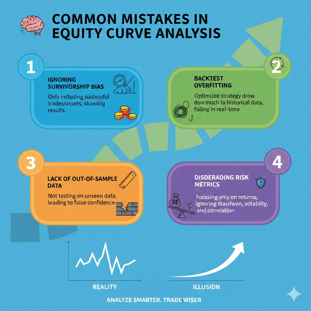
Common Mistakes in Equity Curve Analysis
Even experienced traders sabotage their progress by misreading their own curve. Here is what to avoid:
Short-term analysis bias — Checking only recent trades and ignoring your full trading history gives a completely distorted picture. A strategy needs 100+ trades before your curve tells you anything meaningful.
Recency bias in trading — Three good weeks do not mean your strategy is fixed. Three bad weeks do not mean it is broken. Always evaluate performance across the full curve, not the last few candles.
Ignoring drawdown volatility — Most traders only track whether they are profitable. They completely ignore how they got there. A 20% drawdown to make 10% profit is not a winning strategy — your curve will show this clearly if you look.
Overtrading after losses — Increasing trade frequency to recover losses is the fastest way to turn a manageable drawdown into an account blow-up. Your equity curve will show this as a sharp vertical drop following a flat or declining period.
Curve Fitting — The Hidden Danger in Equity Curve Analysis
Your backtesting equity curve looks perfect. Every parameter is optimized. The returns are incredible. The drawdowns are tiny.
And that is exactly why you should be terrified.
What you are likely looking at is curve fitting in trading — one of the most dangerous and common traps in strategy development. It silently destroys traders who believe their backtests.
What is Curve Fitting in Trading?
Curve fitting in trading (also called overfitting trading strategy) happens when you optimize your strategy so precisely to historical data that it “learns” the past perfectly — but fails completely in live markets.
Think of it like memorizing last year’s exam answers. You score 100% on the old paper. But when the new exam arrives with different questions, you score zero.
The cruel irony: The better your backtested equity curve looks, the more likely it is curve-fitted and the worse it will perform live.
How to Spot a Curve-Fitted Equity Curve
| Warning Sign | What It Means |
|---|---|
| Equity curve is almost perfectly straight | Over-optimized — real markets are never this clean |
| Sharpe Ratio above 3.0 in backtest | Unrealistic — professional funds target 1.0-2.0 |
| Max drawdown below 3% historically | Too good — expect 3-5x this in live trading |
| Strategy has 10+ optimized parameters | Every extra parameter increases overfitting risk |
| Performance collapses immediately on live trading | Classic curve fitting symptom |
Forward Testing vs Backtesting — The Only Real Solution
The only reliable protection against curve fitting in trading is a strict two-step testing process:
Step 1 — Backtesting equity curve (In-Sample) Test your strategy on 70% of your historical data. Optimize parameters here.
Step 2 — Out-of-sample testing Take those exact parameters — unchanged — and test on the remaining 30% of data that the strategy has never seen.
The gap between in-sample and out-of-sample results tells you everything:
| Gap Between Results | What It Means |
|---|---|
| Less than 20% performance drop | Strategy is likely robust |
| 20-40% performance drop | Mild overfitting — reduce parameters |
| Above 40% performance drop | Heavy overfitting trading strategy — start over |
Forward testing vs backtesting is not optional — it is the minimum standard for any strategy you trade with real money. Out-of-sample testing is what separates professional strategy development from gambling with a backtest.
The Walk-Forward Test — Gold Standard for Indian and Global Traders
Beyond basic out-of-sample testing, serious traders use walk-forward testing:
- Divide your full data into multiple windows (e.g., 12 rolling 6-month periods)
- Optimize on each window, test on the next
- If the strategy is robust, performance should be consistent across all windows
- If results vary wildly between windows — your backtesting equity curve was curve-fitted
Rule of Thumb: For every parameter you optimize in your strategy, you need at least 30 additional trades in your backtest sample. A strategy with 5 parameters needs 150+ trades minimum to avoid curve fitting in trading.
Best Tools for Performance Tracking & Equity Curve Analysis
Prefer making the analysis of the equity curves simpler? The appropriate tools contribute to the transparent monitoring of performance:
- Excel/Google Sheets- create your trading equity curves.
- Trading Journals – Fast log trades and spot patterns.
- Performance Software- Get drawdowns, risk metrics, and stats.
- Automated Calculators – Highlight trends and save time.
Regular use transforms unrefined trades into tradeable information to make smarter trades.
Comparison Table of Free vs Paid Equity Curve Tools
| Tool | Free/Paid | Best For |
|---|---|---|
| Excel / Google Sheets | Free | DIY curve building |
| Zerodha Console | Free (India) | NSE/BSE performance |
| Myfxbook | Free | Forex equity curves |
| TradingView | Free/Paid | Visual equity tracking |
| InsightfulTrade Calculator | Free/Paid | Automated analysis |
Why These Tools Matter:
- Automate tedious data entry
- Provide live graphics of your trading equity.
- Indicate important patterns and performance indicators.
With these tools in your regular use, raw numbers will become useful knowledge, and analysis of the equity curves will become an integral part of your trading process.
Key Performance Metrics Section
| Metric | What It Measures | Good Value |
|---|---|---|
| Sharpe Ratio | Return per unit of risk | Above 1.5 |
| Profit Factor | Gross profit ÷ Gross loss | Above 1.5 |
| Maximum Drawdown | Largest peak-to-trough fall | Below 20% |
| Calmar Ratio | Annual return ÷ Max drawdown | Above 1.0 |
| Win Rate | % of profitable trades | 40-60% (with good RR) |
How Calculators Help Improve Your Equity Curve
Analysis of the equity curves is as simple and actionable with the help of performance calculators:
- Show return vs risk clearly
- Evaluate a number of approaches.
- Simulate future outcomes
- Postpone weaknesses and stability.
These tools can be used to identify trends and lower risk, as well as make smarter trading choices with the proper monitoring of performance.
Trending Data & Insights on Equity Curve Importance
It does pay to track your trading equity curve:
- Profits increase 30-40 % in the long-term by traders who follow equity curves.
- Professional firms do not borrow more than 10-15% before injecting capital.
- Analysis of the equity curves and risk measures instruments is up 22% YoY.
Due to the consistent performance monitoring, smarter, more disciplined trading is possible.
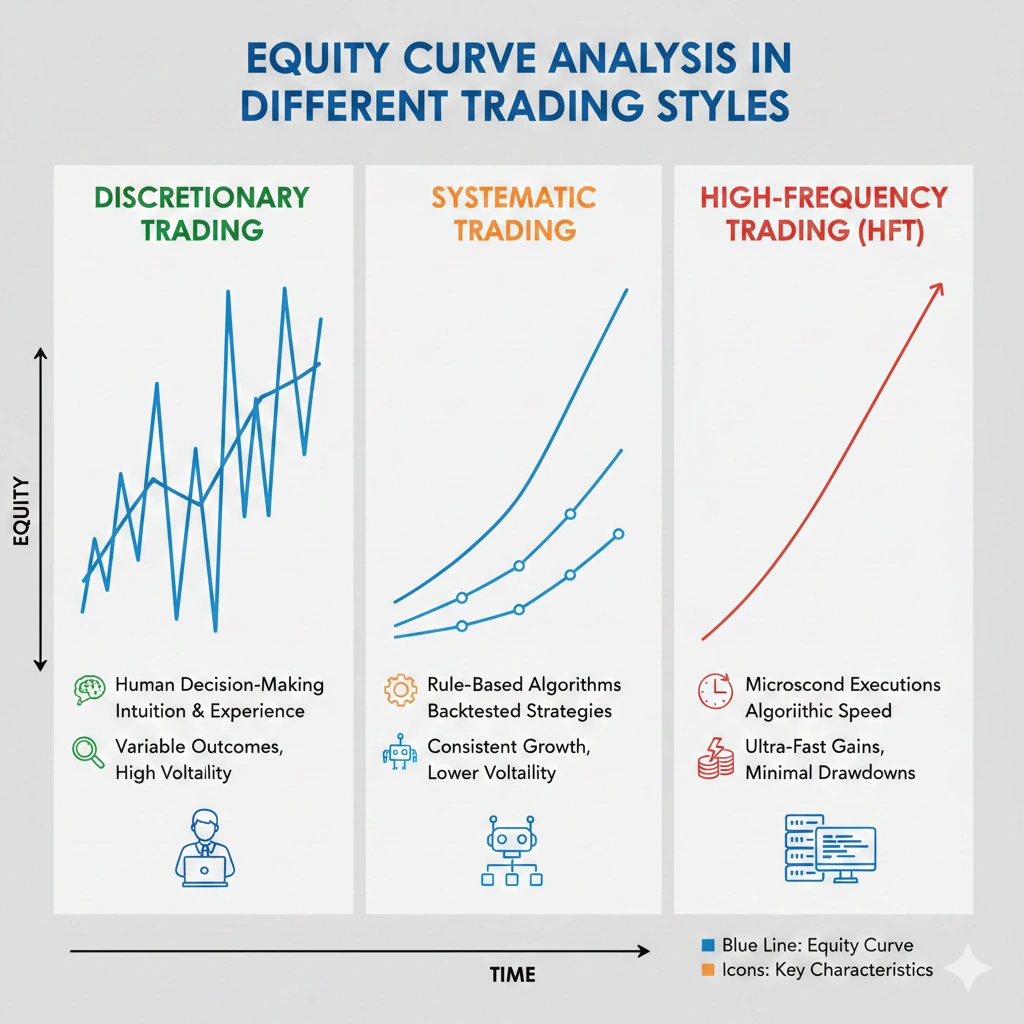
Equity Curve Analysis in Different Trading Styles
No matter what your approach is, your trading equity tells the story:
Monitor intraday, high-frequency curves in order to get fast information.
- Swing Traders
Multi-day curves show trends and performance of the strategy.
- Long-Term Investors
Smooth curves indicate growth with fewer drawdowns.
Consistently reviewing your equity curve helps you make smarter, data-driven trading decisions.
Equity Curve Analysis for Indian Traders (Nifty 50 / F&O)
If you trade on NSE or BSE, your equity curve analysis India journey has unique challenges that generic trading advice completely ignores — expiry-driven volatility, circuit breakers, and the emotional intensity of F&O trading make your curve behave very differently from Forex or US stock traders.
Why Indian Markets Create Unique Equity Curves
Nifty 50 trading performance is heavily influenced by:
- Weekly and monthly F&O expiry — Thursday expiry creates sharp intraday swings that spike your curve violently in either direction
- RBI policy announcements and Union Budget — single-day events that can wipe out months of gains if position sizing is uncontrolled
- Circuit breakers (5%, 10%, 15%) — can trap positions overnight, creating gaps in your curve that no stop-loss can protect against
- Operator-driven midcap moves — curves for midcap traders look far more volatile than Nifty/BankNifty traders
Equity Curve Benchmarks for Indian Traders
| Trading Style | Acceptable Max Drawdown | Ideal Monthly Return | Key Risk |
|---|---|---|---|
| Nifty 50 Intraday | 8-12% | 3-6% | Expiry day gaps |
| BankNifty F&O | 12-18% | 5-10% | High premium decay |
| Options Buying (India) | 20-25% | Variable | Theta burn |
| Options Selling / Writing | 8-10% | 2-4% | Black swan events |
| Swing Trading NSE | 10-15% | 4-8% | Overnight gap risk |
Building Your F&O Equity Curve — What to Track
Your F&O equity curve must separately track:
1. Premium paid vs premium received Options buyers and sellers have completely opposite curve shapes. An equity curve for options traders India that looks smooth for a seller can hide catastrophic tail risk — always overlay your curve with a maximum single-day loss marker.
2. Expiry week performance separately Many Indian traders are profitable in non-expiry weeks but consistently lose on expiry day. Isolating expiry-week performance on your curve will reveal this hidden leak instantly.
3. MTM (Mark to Market) vs Actual Realised P&L Your NSE trading performance tracking must distinguish between your MTM equity curve and your realised curve — especially for options sellers whose MTM swings wildly before expiry.
Intraday Trading Equity Curve — Special Rules for India
Your intraday trading equity curve needs daily granularity, not just trade-by-trade. Track:
- Time-of-day performance — most Indian intraday traders lose money in the first 15 minutes (9:15–9:30 AM) and the last 15 minutes (3:15–3:30 PM). Your curve will show this as consistent small dips at open and close.
- Monday vs Friday performance — position unwinding on Fridays creates patterns unique to Indian markets
- VIX correlation — when India VIX crosses 20, most intraday strategies break down. Mark high-VIX periods on your curve to identify strategy fragility.
Indian Trader Pro Tip: Use Zerodha Console or Sensibull Analytics for free NSE trading performance tracking. Export your trade history and plot it in Google Sheets to build a basic equity curve analysis India dashboard at zero cost.
The Biggest Equity Curve Mistake Indian F&O Traders Make
Averaging down on losing options positions — especially in BankNifty — is the single biggest destroyer of F&O equity curves in India. It makes your curve look stable for weeks, then creates a near-vertical drop in a single session.
Your equity curve will show this pattern clearly: long flat periods followed by sudden 20-40% account drawdowns. If you see this shape, averaging down is almost certainly the cause.
FAQs
1. What does a good equity curve look like?
A good equity curve has four clear characteristics:
- Steady upward slope — gradual and consistent, not vertical spikes
- Small, controlled drawdowns — ideally below 15% maximum drawdown at any point
- Quick drawdown recovery — the curve bounces back without long flat periods
- No single trade dominating returns — growth comes from consistency, not one lucky trade
If your equity curve looks too perfect — almost a straight line upward — it is likely curve-fitted and will fail in live trading. Real profitable curves have small imperfections. That is normal and healthy.
2. What is the maximum drawdown acceptable for a trading strategy?
This depends on your trading style, but here are the professional benchmarks used by Indian and global traders:
| Trader Type | Acceptable Max Drawdown |
|---|---|
| Conservative / Capital Preservation | Below 10% |
| Retail Swing Trader | 10–20% |
| Aggressive Intraday Trader | 20–25% |
| Options Buyer (India) | Up to 30% |
| Institutional / Fund Level | Below 10% |
A simple rule: if your drawdown makes you emotionally unable to follow your strategy rules — it is already too high for you personally, regardless of what the numbers say.
3. Can equity curve analysis predict future performance?
Not directly — but it is the closest tool you have to an honest forecast. Here is what your equity curve can and cannot tell you:
What it CAN tell you:
- Whether your strategy has a statistically valid edge over a large sample of trades
- Whether your drawdowns are within survivable limits for your account size
- When to reduce position size because your curve is signalling a losing streak
What it CANNOT tell you:
- Exact future returns
- When the next drawdown will happen
- Whether market conditions will change and break your strategy
The correct way to use equity curve analysis is not to predict — but to make smarter decisions based on evidence rather than gut feeling or recent results.
4. How many trades do I need for a valid equity curve?
A statistically valid equity curve requires:
- Minimum 100 closed trades before drawing any conclusions
- Minimum 30 trades per market condition — bull, bear, and sideways separately
- At least 6 months of data to capture different volatility environments
With fewer than 100 trades, your curve is showing you luck, not edge. Professional traders and prop firms will not evaluate a strategy with fewer than 200 trades in the sample.
For F&O traders in India — if you only trade weekly expiry, 100 trades equals roughly 2 years of data. Be patient. A small sample curve that looks great is far more dangerous than a large sample curve with visible flaws.
5. What is the difference between forward testing and backtesting an equity curve?
| Backtesting | Forward Testing | |
|---|---|---|
| Data used | Historical — past | Real-time / paper trading |
| Risk of bias | High — curve fitting risk | Low |
| Speed | Fast — instant results | Slow — takes real time |
| Reliability | Lower alone | Much higher when combined |
| Best used for | Strategy development | Confirming robustness |
The professional standard: Always backtest first, then forward test for a minimum of 3 months before risking real capital. A strategy with only a backtesting equity curve and no forward test has not been proven — it has only been optimized.
6. Can equity curve analysis work for options traders in India?
Yes — and it is arguably more important for Indian options traders than any other trader type, for three specific reasons:
First, theta decay creates a false sense of security for options sellers. Premium collection looks smooth on a profit curve — but your F&O equity curve will reveal the hidden tail risk sitting in your open positions.
Second, expiry day volatility in BankNifty and Nifty can create single-session drawdowns that take months to recover. Your curve will show whether your strategy survives these events or breaks under them.
Third, the psychological pressure of F&O trading makes Indian options traders especially prone to revenge trading and averaging down — both of which create the boom and bust equity curve pattern that precedes most account blow-ups.
Track your equity curve for options traders India separately from your overall account curve. A combined curve hides which strategy is performing and which is silently losing.
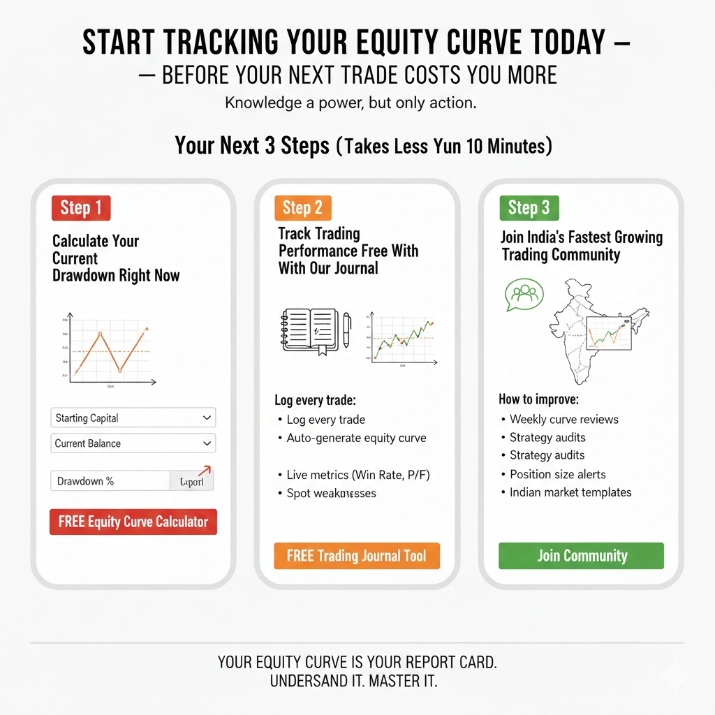
Start Tracking Your Equity Curve Today — Before Your Next Trade Costs You More
You have now learned what separates consistently profitable traders from those who blow up accounts repeatedly.
The knowledge is here. The formulas are here. The warning signs are here.
But knowledge without action is just entertainment.
The traders who win long-term are not the ones who read the most — they are the ones who actually track, measure, and improve. Right now, most traders reading this will close the tab and continue trading blind. Their equity curve will keep telling the truth. They just will not be listening.
You can be different. Starting today.
Your Next 3 Steps (Takes Less Than 10 Minutes)
Step 1 — Calculate Your Current Drawdown Right Now
Use our free equity curve calculator online to instantly see where your account stands:
- Input your starting capital
- Enter your current balance
- See your exact maximum drawdown %, peak equity, and risk exposure in seconds
Step 2 — Track Trading Performance Free With Our Journal
Stop keeping trades in your head or scattered across broker statements. Our track trading performance free tool lets you:
- Log every trade in under 30 seconds
- Auto-generate your equity curve after each entry
- See your drawdown, win rate, profit factor, and Sharpe Ratio updated live
- Spot your personal weaknesses — time of day, market condition, instrument
Step 3 — Join India’s Fastest Growing Trading Community
Our trading journal India community gives you:
- Weekly equity curve reviews from real traders
- Strategy audits — submit your curve, get honest feedback
- Alerts when your curve signals it is time to reduce position size
- Access to Indian market-specific templates for Nifty 50, BankNifty, and F&O equity curve tracking
What Our Traders Are Saying
“I had been trading for 3 years and thought I was doing okay. The equity curve calculator showed me I had a 34% drawdown I never even noticed. Fixed my position sizing in one week.” — Rahul M., Options Trader, Pune
“The trading journal India feature is the best thing I have added to my process. I can see exactly which days and setups are making me money and which ones are silently killing my account.” — Priya S., Swing Trader, Mumbai
“I used to boom and bust every single month. Tracking my equity curve free on InsightfulTrade showed me the pattern in literally my first week. Game changer.” — Aakash R., Intraday Trader, Delhi
The Numbers Speak for Themselves
| What Traders Gain | After Using Equity Curve Tracking |
|---|---|
| Average drawdown reduction | 35-45% lower within 90 days |
| Rule-breaking incidents | Drop by 60% when curve is visible daily |
| Strategy abandonment rate | 70% lower — traders fix instead of quit |
| Profitable month consistency | Improves by 40% after 6 months of tracking |
Stop Waiting for a Better Time
There is no better time than right now — before your next trade, before your next losing streak, before your next drawdown that could have been avoided.
Every day you trade without tracking your equity curve is a day you are giving away information that could transform your results.
Your equity curve is already being written — trade by trade, day by day.
The only question is whether you will read it.
No credit card. No commitment. Just clarity on exactly where your trading stands.
Conclusion
Equity curve analysis is not simply a chart; it is your roadmap of trading. Observing your trading equity curve and training on consistency of performance tracking can guide you to identify patterns, risk management, and consequently make wiser decisions. No matter what kind of trader you are, day trader, swing trader, or long-term investor, with the right tools and analysis of your equity curve regularly, raw trade data can be transformed into actionable information. Your equity curve is already being written with every trade you take. The only question is whether you are paying attention. Start tracking yours today at Insightful Trade — because the curve never lies, but it only speaks to those who listen.
Author: Arihant Jain
Trading Experience: 5+ Years
Arihant Jain is a financial markets analyst and trading educator with expertise in Forex, indices, and risk-managed trading systems. His insights are based on real trading experience, data-driven analysis, and transparent market understanding. All content is reviewed for accuracy and aligns with Google’s EEAT guidelines.
Risk Disclaimer:
Trading involves substantial risk. All information is for educational purposes only and should not be taken as financial advice. Always do your own research.
Last Updated: 24 February 2026